Háblame
+ Interactive Video for Language Learning +
Client | A Leading Company in Education & Publishing
Time | Jan 2019 - Aug 2019 (8 mos)
My role | Design Lead (in team of 5)
Skills | Adobe Suite, UX/UI Design, Web Design, User Research, Wireframing, Prototyping
◇
Highlights
Interactive video with branching and personalized storyline.
Automatic Speech Recognition (ASR).
Conversational User Interface design.
Adaptive feedback and scaffolding.
◇
Problem Statement
To create an authentic and immersive learning experience for second language learners to hone oral communication skills.
◇
Product Overview
Háblame
Try the prototype below!
◇
Design Process
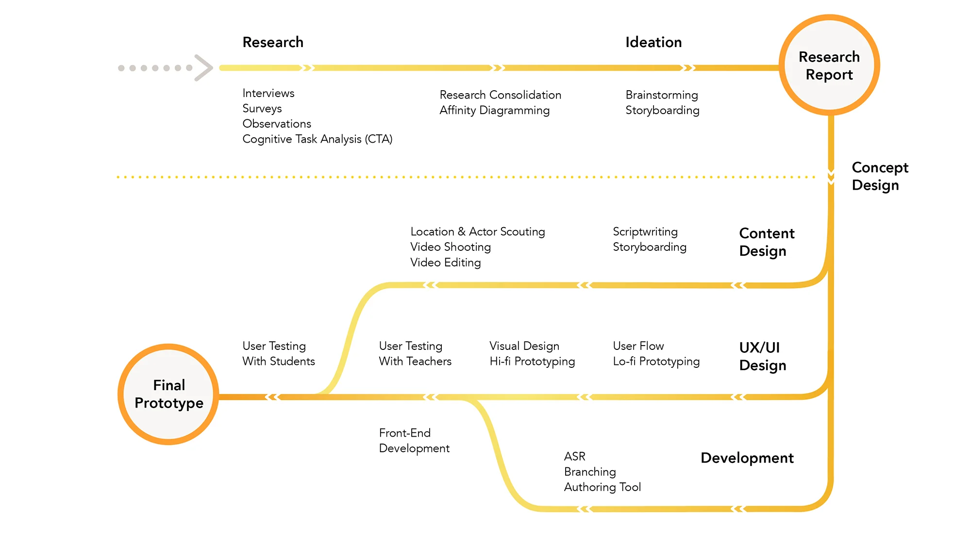
The 8-month long project consists of two main parts. In the first half, we applied a variety of research methodologies to understand the problem, users, and possibilities. In the second half, we concentrated on design and development of one final idea.
Problem Space
“How might we create an authentic learning context for second language learners to improve oral communication performance?“
Questions To Ask
1. What is Second Language Acquisition (SLA) ?
2. Who are the learners? How do they currently learn?
3. What are the major breakdowns in their current learning experience?
4. How can we innovate to improve learning experience and outcome?
5. How do we measure the success of our design?
Secondary Research
In order to better understand the domain we will be innovating in, we conducted secondary research in three sub-domains: pedagogy, technology, and policy & research. In order to answer the question “how do we measure the success of our design“, we did in-depth research on ACTFL standards - a serious of widely applied criteria on accessing second language learning outcome.
Primary Research
According to the requirements from our clients, the target users of our prototype will be novice Spanish language learners in grade 6-12. However, the concept of the product should also be generalizable to a broader range of users and languages.
To have a better perspective of the design landscape, we conducted interviews, focus groups, surveys, and observations in local schools.
Key Findings From Field Research
In total, we did 10 interviews with teachers, 8 classroom observations, 2 Cognitive Task Analysis (CTA), as well as 12 interviews with subject matter experts (SMEs). From these studies, we were able to discover emerging patterns in current language learning practices.
1. In novice-level classes which are always larger, the oral communication practice an average student is getting is far less than needed. Most students we observed only have less than 5 minutes to speak the target language in class.
2. Most students are more motivated and engaged in interactive activities such as games (Kahoot!). However, classroom management can be a huge pain for teachers especially in lower level classes.
Student Survey
In order to hear from a wider range of students, we designed an online survey regarding Spanish learning experience and distributed to local schools. Eventually, we were able to collect more than 440 responses, mostly within our targeted grade levels. Some of the questions are shown below.
“More than 440 survey responses fueled our design decisions.”
Key Findings From Surveys
1. Watching videos and playing games (digital and physical) are the two most favorable learning activities among students.
2. Traveling, talking to people from different countries, and studying or living abroad are the three most popular motivations of learning a second language among students.
3. There is a correlation between student’s motivation and their expected learning engagement.
4. Students, regardless of their purpose of learning a second language, demonstrated a strong preference in gamification.
Research Consolidation
After 2 months of secondary and primary research, we had a rich amount of data in hand. Now the question is: How do we make sense of all these data to answer the questions we had in mind?
Student Personas & Experience Map
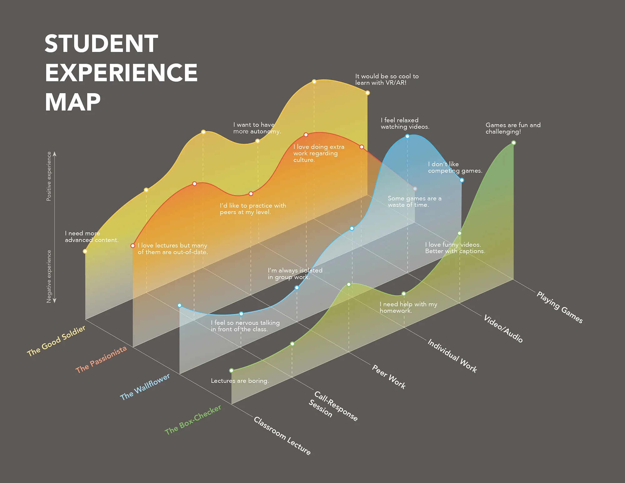
From our field research and student survey, we discovered four major types of students according to their motivations and performance. We name them as “The Box-Checker“, “The Wallflower“, “The Good Soldier”, and “The Passionista“. We designed four student personas and a corresponding experience map to demonstrate their individual needs and painpoints.
Highlights In Student Experience Map
From the student experience map shown above, it’s not hard to realize that for the two personas with higher motivation, all activities are favorable. However, this is never the case for the other two personas: The Wallflower and The Box-Checker both lean towards interactive activities.
Although in this project, we are not focusing on a specific type of learner, we want to make sure that what we make is acceptable to “an average student“ and is generalizable to a wide range of classrooms.
Teacher Personas
Although teachers are not the primary users of our product, they are the most important “influencers” and “implementers“. To guarantee teachers’ buy-in, the product has to be friendly ,effective, and stands out from competitors.
Highlights From Teacher Personas & Experience Map
We included two types of teachers in the personas: The Veteran and The Rookie. Teachers with different experience level have different focus in their teaching. They also have different attitude towards emerging technology. In the experience map, we can see most teachers share the same overall workflow. It is important that our final product can fit into this workflow, maybe in multiple phases.
Key Takeaways
Ideation & Co-Design
Fueled by the research data, we moved to the ideation phase. We first did several rounds of brainstorming activities within the team, and came up with more than 10 ideas. We also developed demo prototypes to go along with the storyboards to better demonstrate the concept.
In May, we held an in-person meeting with our clients to present our research findings and ideas. During the meeting, we had a co-design session with them and narrowed the scope down to move forward.
Storyboarding
After an internal meeting of the client side, we reached agreement to move forward with the idea of “Interactive Video“. The original storyboards are shown below.
User Flow
We started our design process with user flow. Since the core function of the platform is the interactive video, we divided the flow into three parts: pre-video, video, and post-video experience.
Wireframing
According to our research, personal computer is the most accessible device for 6-12 graders. Therefore, we decided to develop a desktop website. Due to technical constraints, the website works best in Chrome browser, which aligns with the fact that Chromebooks are widely used in schools.
Lo-fi Prototyping
After a team-wide discussion over the wireframes, we designed a lo-fi prototype using Figma. The prototype is in greyscale so that people can focus on the functionality and information architecture of the design without getting distracted by colors. We also added some basic hotspot to demonstrate the overall user flow.
Style Guide
Before moving on to hi-fi prototype, we developed a style guide with typography, color palette, and other standardized elements to keep style consistency and help communicate within the team.
In this project, we applied the 8pt grid spacing system from material design principles, which means the font size, spacing, margin and padding will be a multiple of 8. This system creates a more natural visual experience and is easier for front-end development.
“Why these colors?
Cultural authenticity, branding, and accessibility!”
Cultural Authenticity
Authenticity is one of the core requirements from the client side. How can we convey the authenticity with visual representations? While seeking inspirations, we built a mood board with Latino artworks. From there, we were able to discover some patterns of color use - Latino colors are bright, vivid, and diverse, which aligns with the preference our target age group.
Branding
When choosing the main theme colors, we took into account the color palette of our client for branding purpose. We finally decided to use yellow and purple as theme colors.
Accessibility
Accessibility is a major focus from the design side. We applied WCAG AA standards. All text-background contrast could pass the AA test.
Hi-fi Prototype
By applying the style guide, we designed a clickable hi-fi prototype. This prototype was used for early stage user testing.
Testing & Iterations
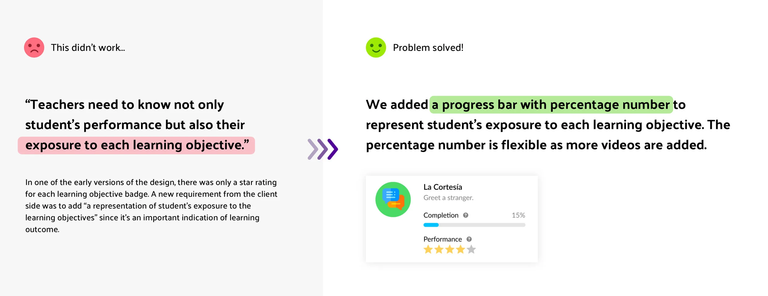
We did 3 rounds of user testing with prototypes of different fidelity. Based on user testing findings, we were constantly making iterations and improvements for the product.


